The Bryter office is based in Shoreditch. For those that have never been here, let’s just say that there are no shortage of places to get coffee or something to eat. Barely a day passes without a new hipster joint opening up, or for that matter closing down. The turnover rate round here is high. Some places open up, do incredibly well then close to move on to bigger and better things. Others open up, quickly find that the market for £4 cups of coffee is tougher than they imagined, burn through a pile cash and then disappear without a trace. So, what separates the winners from the losers in this highly competitive space, and what can we learn from these stories of success and failure?
We’re a market research company, not a collective of restaurant critics so we don’t claim to be able to spot or back a winner in this game. But there was one restaurant that opened locally that we were all sure would fail, and this was without ever going in to try the food, which apparently was very nice if you read the online reviews. The reason was more straightforward than that, and it related more to usability and human needs than it did to culinary proficiency. The physical layout and design of this restaurant was so obviously flawed from the start, that it was doomed to fail. In fact, it never stood a chance.
So, what was it about the design of this place that the local market research agency rather than the local restaurant critics were so sure its days were numbered? Well, the answer to that lies in understanding what customers want from an experience. The question in this case is why do we go to restaurants, and what do we want from a restaurant experience?
A big part of why we go to restaurants, and then return if we like it, is the food. If you look at the online reviews for this restaurant it gets great scores. The food is excellent, the service is great, there are literally no complaints about what people are served, or how it is served to them. So how come the place tanked in less than a year?
It comes down to failing to understand the social aspect of the restaurant experience. Something this place and its designer decided to ignore in favour of trying to be different in order to stand out. We go to restaurants to spend time with people we like, to socialise, have fun, be romantic, and a big part of that is being able to relax and to hold conversations.
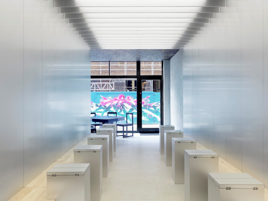
Take a look at the picture below; this is the dining area.

Can you spot the problems here? There is only one proper table where you can seat more than two people at a time, not great if there are more than two of you looking to eat together. So, having ruled out the group dining experience, let’s take a look at the set up for couples. Again, it would seem there are some pretty obvious design flaws here that will have a negative impact on your dining experience. All the two diner tables force you and your companion to sit side by side with what looks like a foldout airline tray between you to eat from. This would seem to be such an obvious design flaw that you wonder how this ever got past the first draft of the sketches before the owner rejected it. Most people, especially couples, aren’t looking to recreate the experience of sitting on a bus shelter bench and sharing a meal when they go out to eat.
We would walk past this restaurant on a daily basis, and see people awkwardly sat side by side with the foldout trays trying to relax and enjoy a meal, but funnily enough, not looking all that comfortable. You’d think anyone, including the restaurant owner and the architect would have experienced what its like to sit next to someone on a plane, share drinks and snacks, and realise that this is a terrible concept for a restaurant design. And this is why the place failed. It got it right with one aspect of the customer experience (the food), but failed utterly on the other important human side of the dining experience and why we go to restaurants. In its bid to do something bold and different with its design it undermined one of the most important needs we have as diners, the need to be social.
Learn more about how market research can be used to better understand the needs of customers in different sectors and support the development and successful launch of new products and services
Bryter is a UK and US based research and insight consultancy, get in touch to find out how we can help your business better understand human needs to build better products and solutions info@bryter-uk.com


